14/10/2006


Here's the Sun Vs The Gun Front Cover :

Here is a pic of the finished front cover before it went to print. By using the Sun as the content for the front cover using the layout of Gun Mart the result is very convincing. After working with content and layout I have begun to appretiate how a successfully designed layout is an important factor in relation to the message being communicated effectively. I think the final result is a successful one mainly because we had put into practise what we had learnt from problems throughout part one. Although we came up agianst some problems througtout this part of the project we managed to solve them. Most of them were mainly relating to image quality and fonts as you can see from some of the images and text. Some of the images were of such low res (Probs beacuse of the newsprint they were printed on) we decided to edit them out and replace them with higher res ones. An example of this is when we used the original picture (10 Downing Street Door) from the Sun. It became so pixelated when enlarged that we had to find and use a higher res one from the internet. After I worked on it in photoshop the image was ready to be used. I think that this image works well considering the circumstances although it's a shame we couldn't find another pic in higher res so we could have stretched it to fit the whole cover without it pixellating. However, Despite a few setbacks I think the end result is a successful one.

....and here's a screen grab of the double page article.

Here is the final double page layout of Gun Mart with the Sun's content. This is now ready for printing. I think this has turned out really well and we are pleased with the result. We spent some time making decisions about where to place the headings, images and text within the layout whilst editing some of the Sun's content. I think we have represented the content in the Gun Mart's layout really well.

12/10/2006

Now that we made the improvements for part one, We've now started on part two. We swapped the digital files for part one with group 3 and we got thier files. Group three were working on The Sun newspaper so we had to take thier content and place it within the layout for Gun mart mag although it was possible to edit images and text as much as we liked. We experienced a few problems in doing so such The Sun's low res quality pictures as they had been printed on newspaper. After importing them into the layout of Gun Mart we worked together to make some adjustments to form a realistic composition for both the article and front cover. Creating the front cover was a challenge as it realied heavily on image. Anastasia and I had to scout around on the net to find some better quality pictures such as 10 Downing street door (The best image to use for the front) which were then adjusted in photoshop. I think the layout for both the article and the front cover has worked really well, All that is left now is to get the versions printed for the crit on Tuesday.

Just a little Tweaking.

Today, We started to make improvements to our version of the copy even though we should have started work on the second part of the project. We had to work quickly and efficiently as we were delaying another group from working aswell as limiting our own time to work on ours. The first thing we started to work on was the images as this we thought this would yake the longest. New cans were made of the original version using 450 dpi and then imported into photoshop toi work on them. The new versions of the high res scans turned out o be the best to work from as it provided a detailed image from which to work from. As we working from a new scan we had to make new selections for the images to se in the layout.We used the eyedropper tool again but made sure that we chose the right colour this time , Comparing it with the original before using it in the layout. Next up....The fonts, We decided theat the only way would be to trace the logo in Illustrator and then apply the correct attributes to it. We knew this wasn't exactly live text but knew it would provide us with the best results.

10/10/2006

Crit Results!

The crit didn't go aswell as we thought it may have done. To start with we had a few issues with getting the work printed although we did manage to get it done just in time for presentation. After the crit we spoke to Pete and Luke about the changes we would need to make in order to make our version of the copy more resolved. Most of the comments made we agreed with. It seemed the layout didn't turn out to be the main problem, Instead it was the fonts and image quality that needed more work. It was clear that our copy of the layout seemed to be the most accurate even though It was mostly the Fonts we used that let it down. We would have to reconsider how we are going to make work on this as the text has to be live, Maybe downloading off the wenb will be the oly possible solution. Image quality was another important factor that could be improved. The scan res hindered the quality of the final print out making the images slightly pixelated. We used these low quaility scans with the eyedropper tool to replace some of the colours which evidently proved to be wrong idea so we will need to work on that more. We decided to take a step back and to re-do the copy which would delay the second part of the project. We knew this was important as it enabled us to consider and work on what had been discussed and make improvements.

Just a quick note to show the final double page spread layout for the across pages 91 and 92 after it was printed. I think the layout in the double page spread has worked more successfully than the front cover as there weren't so many typefaces and images to copy. Most of the article's fonts were Franklin Gothic and the header's were Helvetica (Some of which were stretched). Although each of the changes were easy to make we had to think about making changes to the appropriate ones. I think the hardest task of the copying the layout was working with the justification, alignment and spacing of the typefaces which were most commonly found in the headers of the article. I think that working seperately on individual tasks isn't always the best method of getting the work done more efficiently as it was easy to forget who was allocated each task. Overall, I think we worked well as a group for this part of the project with good communication between us.

08/10/2006

Copying the Double Page Spread in Indesign.
Here's to Finding Fonts....

Today was really productive as we worked together to use the files to work on the content for the layout. After exchanging the files Anastasia and I got to work on finding the fonts used for the front cover and article of the magazine. After spending ages sifting through Font book and not finding many of the typefaces that made a perfect match we came to a conclusion that most of the fonts were eithar commercial or that they had used a font such as Helvetica, stretched it and added drop shadows etc! We tried finding the typefaces and downoading them off the web but found most of them didn't even come close to the original ones and even those had a price tag attached to them. We decided that the only option would be to choose a typeface as close to the original as poss. Other probs included the scan quality of the images (150 dpi) which turned out to be a poor quality to work from when imported into photoshop. Although we came up against a few problems we worked together well to solve them.
Live Text:

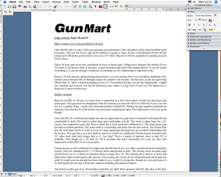
Just to say that today I wrote up the article on the double page spread and saved the document as live text so that it could be imported into the Indesign layout (setup by Sam and James) to be worked on during Friday. Here's a screengrab showing the document setup in Micrsosoft Word before it was burned to disc.
The Indesign Layout For The Front Cover Of Gun Mart.
Copy-Remix-Create-Destroy !

Part One: So here's my very first blog entry....Bring it on!

Part One of the project requires us to work in groups where we have to recreate the copy of the front cover and a selected double page article from a selected magazine. So we were chosen Gun Mart Magazine! Not exactly the most exciting of magazine layouts. The magazine is a disposable monthly publication and is aimed at Gun enthusiasts. As a starting point of the project our group re-read the brief and discussed any potential problems we might experience and how we might solve them. The first thing we noticed was that many of the fonts used on the original seemed to be commercial fonts. This would probably make it difficult tracking them down off the web or finding another font to replace it. Other problems we found were that most of the images overlapped the text which meant that we would have to make scans, Import them into photoshop, make a selection and work on them indivdually. This may be time consuming so we decided to allocate each member of the group a task to work on and then eventually pull all the resources together to create the final copy of the cover and article.